UI / UX Design
Motion Design
Duality of Life Exhibit
A museum exhibit that explores the psychology of hybrid animal and human science
Tools Used :
Figma Photoshop Illustrator After Effects
Design Focus :
Interactive and Experiential

Challenge
How could a digital museum exhibit bridge scientific discovery and human emotion while maintaining mystery and curiosity?
Many museum websites fail to extend the immersive storytelling found in physical exhibits, relying instead on static content and traditional layouts. This project challenged that norm by treating the website as an active extension of the exhibit, designed to engage, provoke curiosity, and feel alive rather than just informational.
Approach
I researched digital exhibits and websites that blend science, data, and visual storytelling to understand how complex ideas can feel immersive rather than informational. This helped me identify what makes a digital experience feel believable, engaging, and purposeful.
I focused on how these projects use typography, hierarchy, motion restraint, and interaction to guide users through content at a controlled pace, creating a sense of discovery through structure rather than spectacle.
By studying narrative flow, visual rhythm, and how subtle interactions support storytelling, I developed a design direction that feels immersive and exploratory without overwhelming the user.
Process
I started by defining the experience and narrative of the digital exhibit, then explored references to establish tone and visual direction. From there, I developed user goals, information architecture, and wireframes that prioritize clear navigation, controlled pacing, and a sense of discovery throughout the site.

*Draggable


Building Hybrids
In Photoshop, I started by gathering reptile textures and high-res stock photos to build each hybrid. I color-corrected, retouched, and blended every element, adding shadows and highlights so the animals all felt like they existed in the same world.

OUTCOMES AND LEARNINGS
This project taught me the value of continuous iteration in creating stronger, more refined design outcomes. By repeatedly revisiting layouts, typography, and interaction details, I was able to resolve inconsistencies and improve clarity across the site. Keeping the target audience at the center of each decision helped ensure the experience remained engaging and purposeful. This iterative approach allowed the final product to feel more cohesive, polished, and intentional as a complete system.
*Draggable


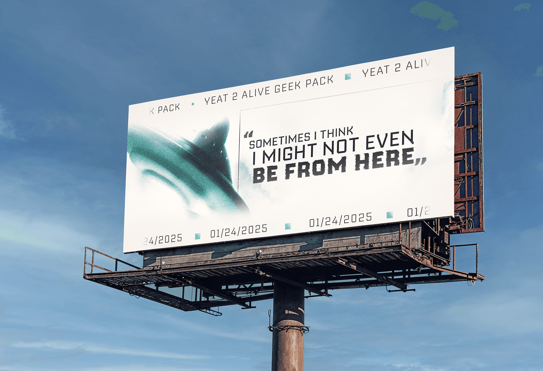
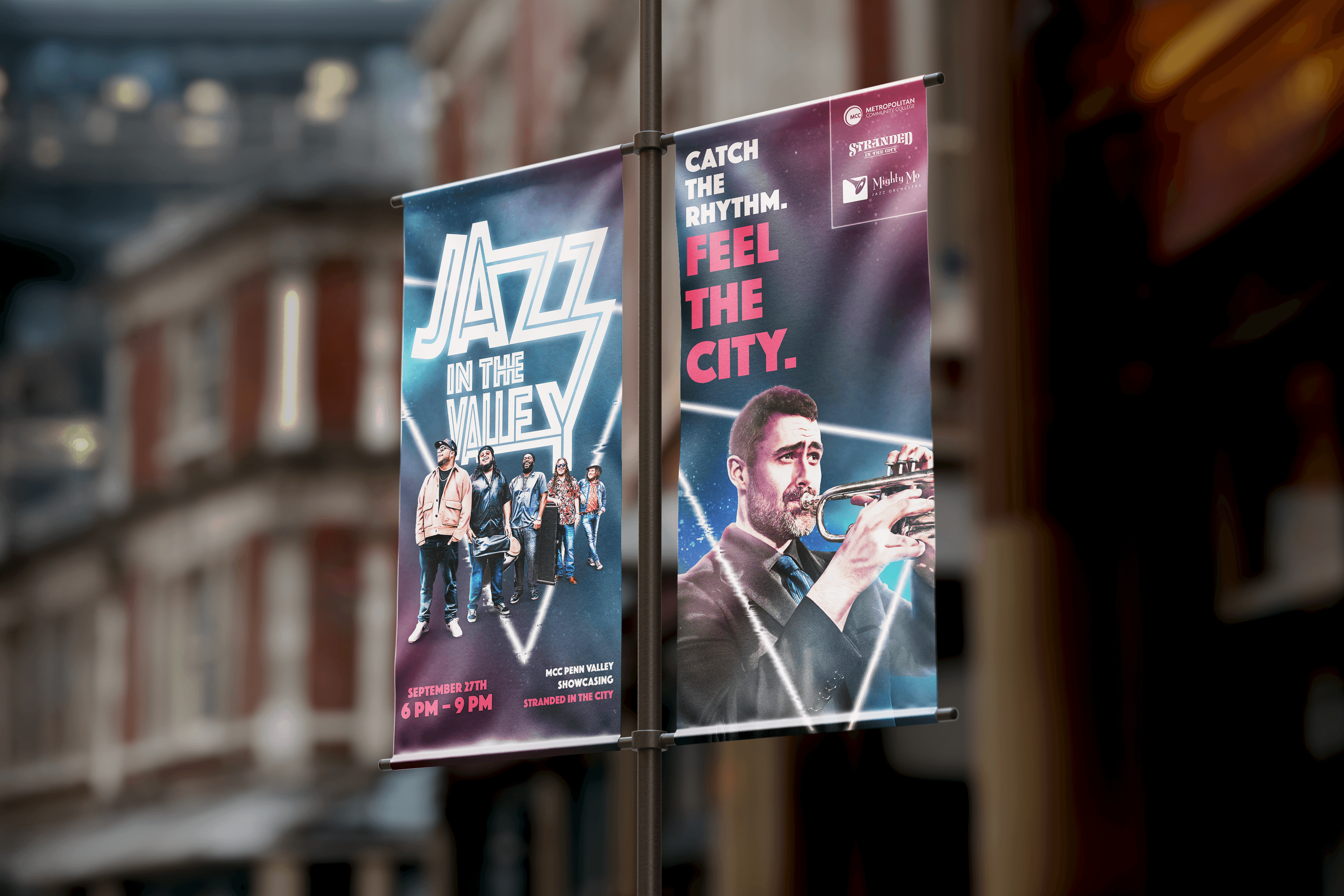
More Projects


UI / UX Design
Motion Design
Duality of Life Exhibit
A museum exhibit that explores the psychology of hybrid animal and human science
Tools Used :
Figma Photoshop Illustrator After Effects
Design Focus :
Interactive and Experiential
Challenge
How could a digital museum exhibit bridge scientific discovery and human emotion while maintaining mystery and curiosity?
Many museum websites fail to extend the immersive storytelling found in physical exhibits, relying instead on static content and traditional layouts. This project challenged that norm by treating the website as an active extension of the exhibit, designed to engage, provoke curiosity, and feel alive rather than just informational.
Approach
I researched digital exhibits and websites that blend science, data, and visual storytelling to understand how complex ideas can feel immersive rather than informational. This helped me identify what makes a digital experience feel believable, engaging, and purposeful.
I focused on how these projects use typography, hierarchy, motion restraint, and interaction to guide users through content at a controlled pace, creating a sense of discovery through structure rather than spectacle.
By studying narrative flow, visual rhythm, and how subtle interactions support storytelling, I developed a design direction that feels immersive and exploratory without overwhelming the user.
Process
I started by defining the experience and narrative of the digital exhibit, then explored references to establish tone and visual direction. From there, I developed user goals, information architecture, and wireframes that prioritize clear navigation, controlled pacing, and a sense of discovery throughout the site.
*Draggable
Building Hybrids
In Photoshop, I started by gathering reptile textures and high-res stock photos to build each hybrid. I color-corrected, retouched, and blended every element, adding shadows and highlights so the animals all felt like they existed in the same world.
OUTCOMES AND LEARNINGS
This project taught me the value of continuous iteration in creating stronger, more refined design outcomes. By repeatedly revisiting layouts, typography, and interaction details, I was able to resolve inconsistencies and improve clarity across the site. Keeping the target audience at the center of each decision helped ensure the experience remained engaging and purposeful. This iterative approach allowed the final product to feel more cohesive, polished, and intentional as a complete system.
*Draggable
More Projects
UI / UX Design
Motion Design
Duality of Life Exhibit
A museum exhibit that explores the psychology of hybrid animal and human science
Tools Used :
Figma Photoshop Illustrator After Effects
Design Focus :
Interactive and Experiential
Challenge
How could a digital museum exhibit bridge scientific discovery and human emotion while maintaining mystery and curiosity?
Many museum websites fail to extend the immersive storytelling found in physical exhibits, relying instead on static content and traditional layouts. This project challenged that norm by treating the website as an active extension of the exhibit, designed to engage, provoke curiosity, and feel alive rather than just informational.
Approach
I researched digital exhibits and websites that blend science, data, and visual storytelling to understand how complex ideas can feel immersive rather than informational. This helped me identify what makes a digital experience feel believable, engaging, and purposeful.
I focused on how these projects use typography, hierarchy, motion restraint, and interaction to guide users through content at a controlled pace, creating a sense of discovery through structure rather than spectacle.
By studying narrative flow, visual rhythm, and how subtle interactions support storytelling, I developed a design direction that feels immersive and exploratory without overwhelming the user.
Process
I started by defining the experience and narrative of the digital exhibit, then explored references to establish tone and visual direction. From there, I developed user goals, information architecture, and wireframes that prioritize clear navigation, controlled pacing, and a sense of discovery throughout the site.
*Draggable
Building Hybrids
In Photoshop, I started by gathering reptile textures and high-res stock photos to build each hybrid. I color-corrected, retouched, and blended every element, adding shadows and highlights so the animals all felt like they existed in the same world.
OUTCOMES AND LEARNINGS
This project taught me the value of continuous iteration in creating stronger, more refined design outcomes. By repeatedly revisiting layouts, typography, and interaction details, I was able to resolve inconsistencies and improve clarity across the site. Keeping the target audience at the center of each decision helped ensure the experience remained engaging and purposeful. This iterative approach allowed the final product to feel more cohesive, polished, and intentional as a complete system.
*Draggable