UI / UX Design
Branding
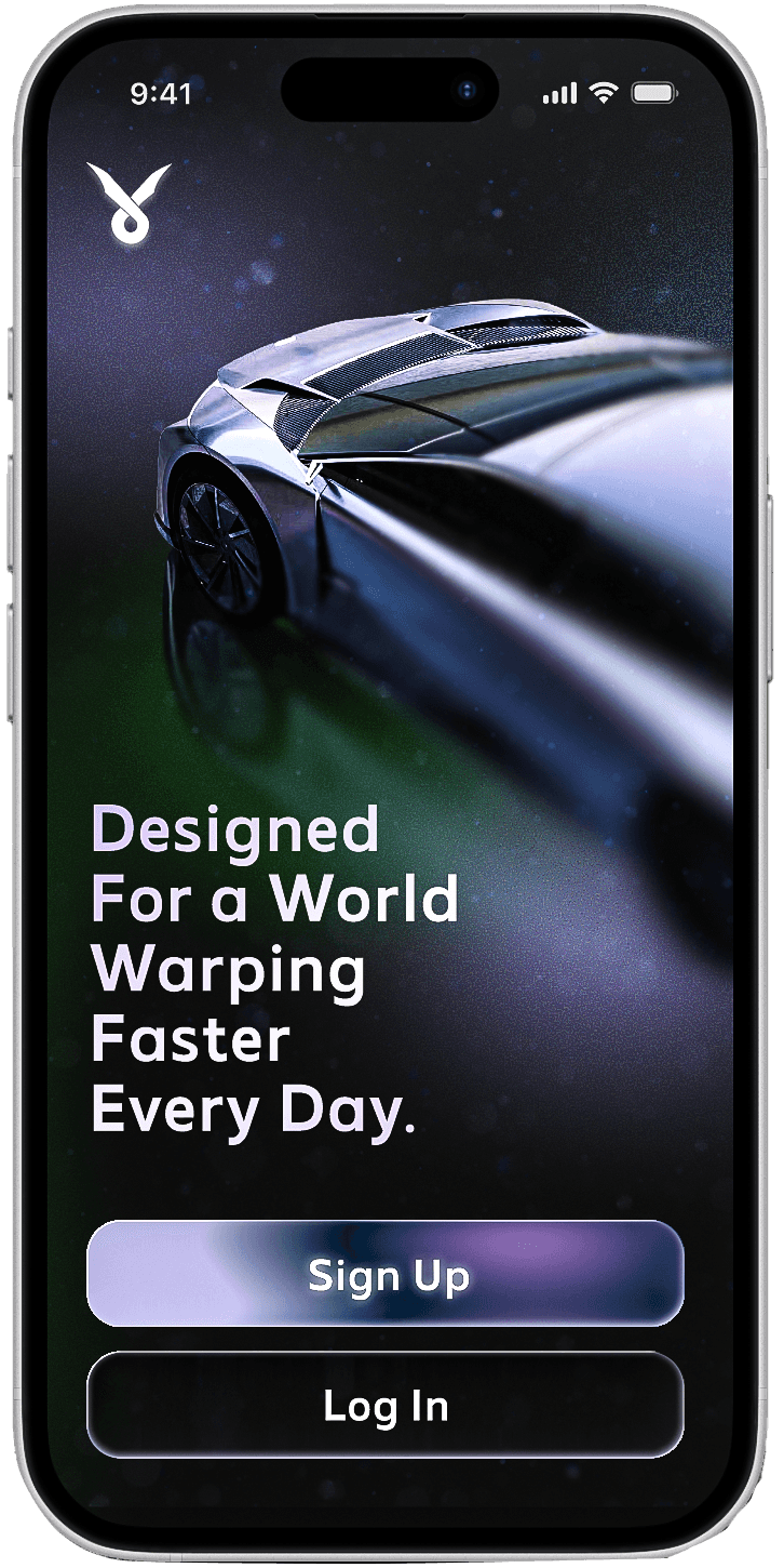
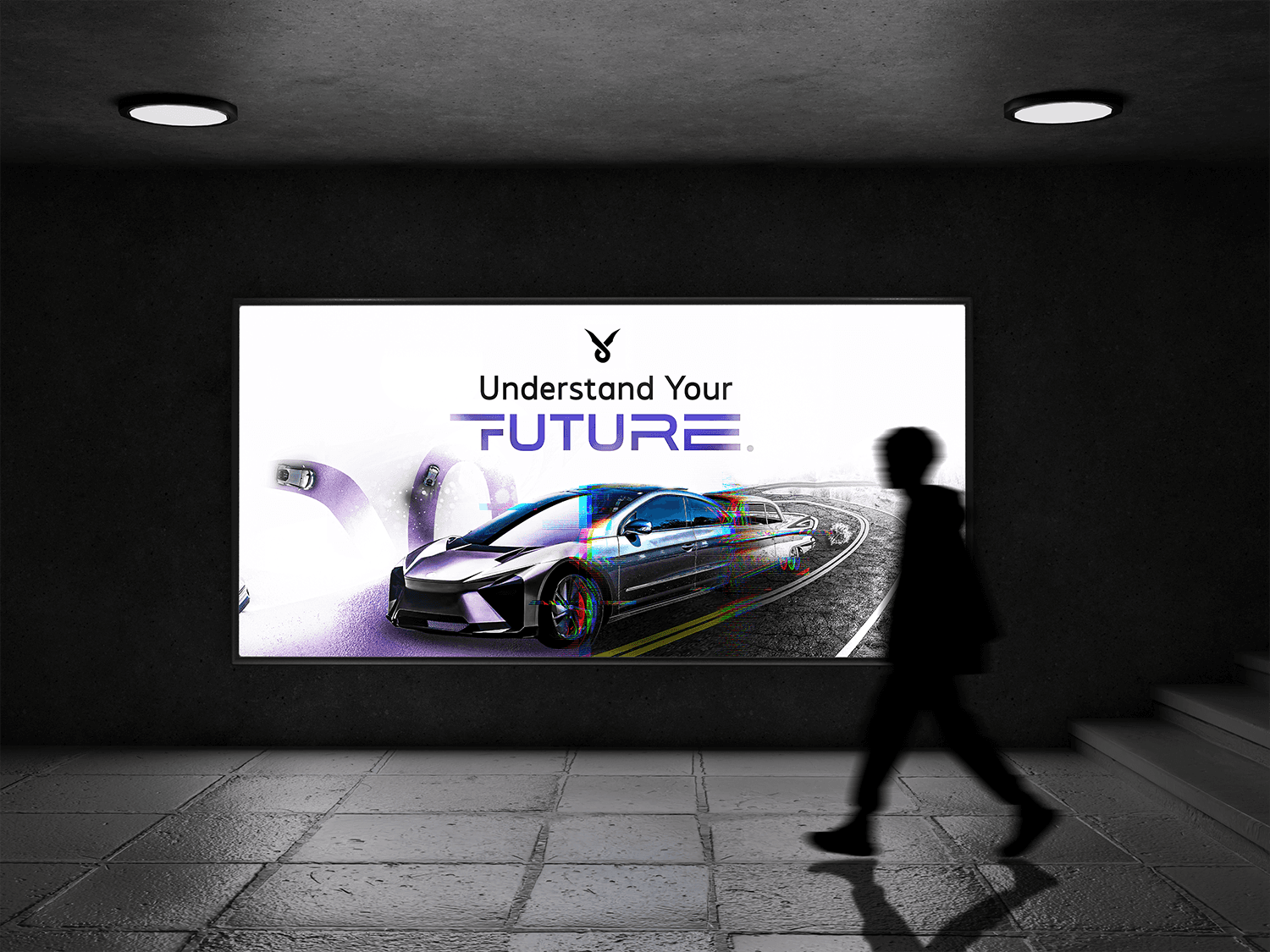
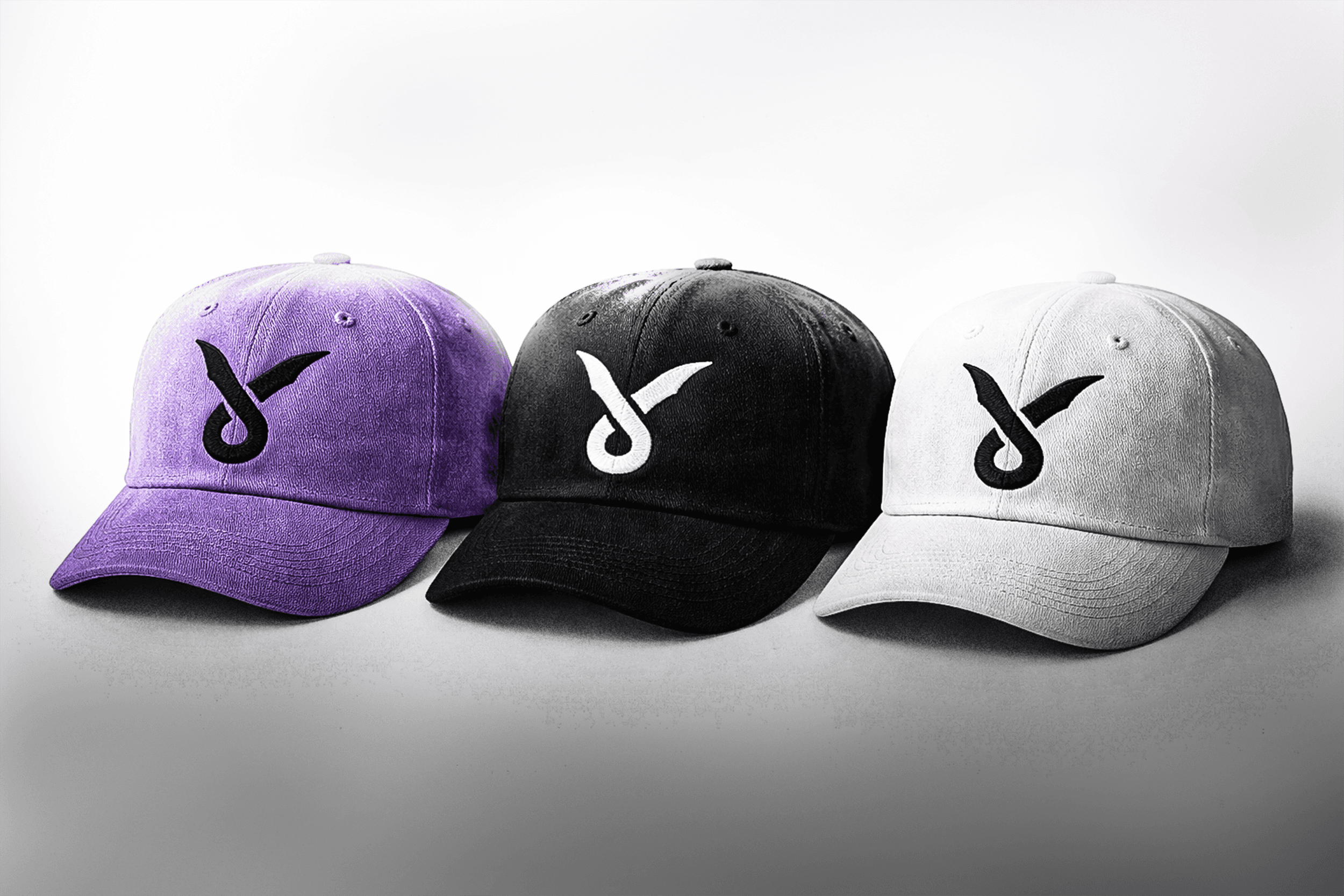
Velocity Motors
An automotive brand that prepares its audience for the warping fast paced future coming ahead
Tools Used :
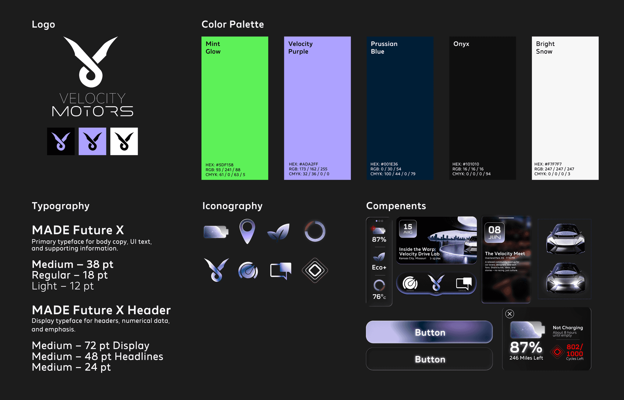
Figma Photoshop Illustrator After Effects
Design Focus :
Brand Systems & Digital Experience
Challenge
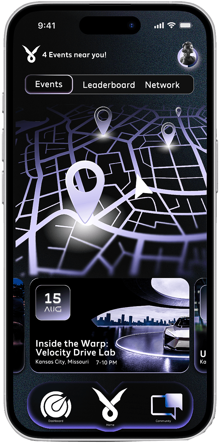
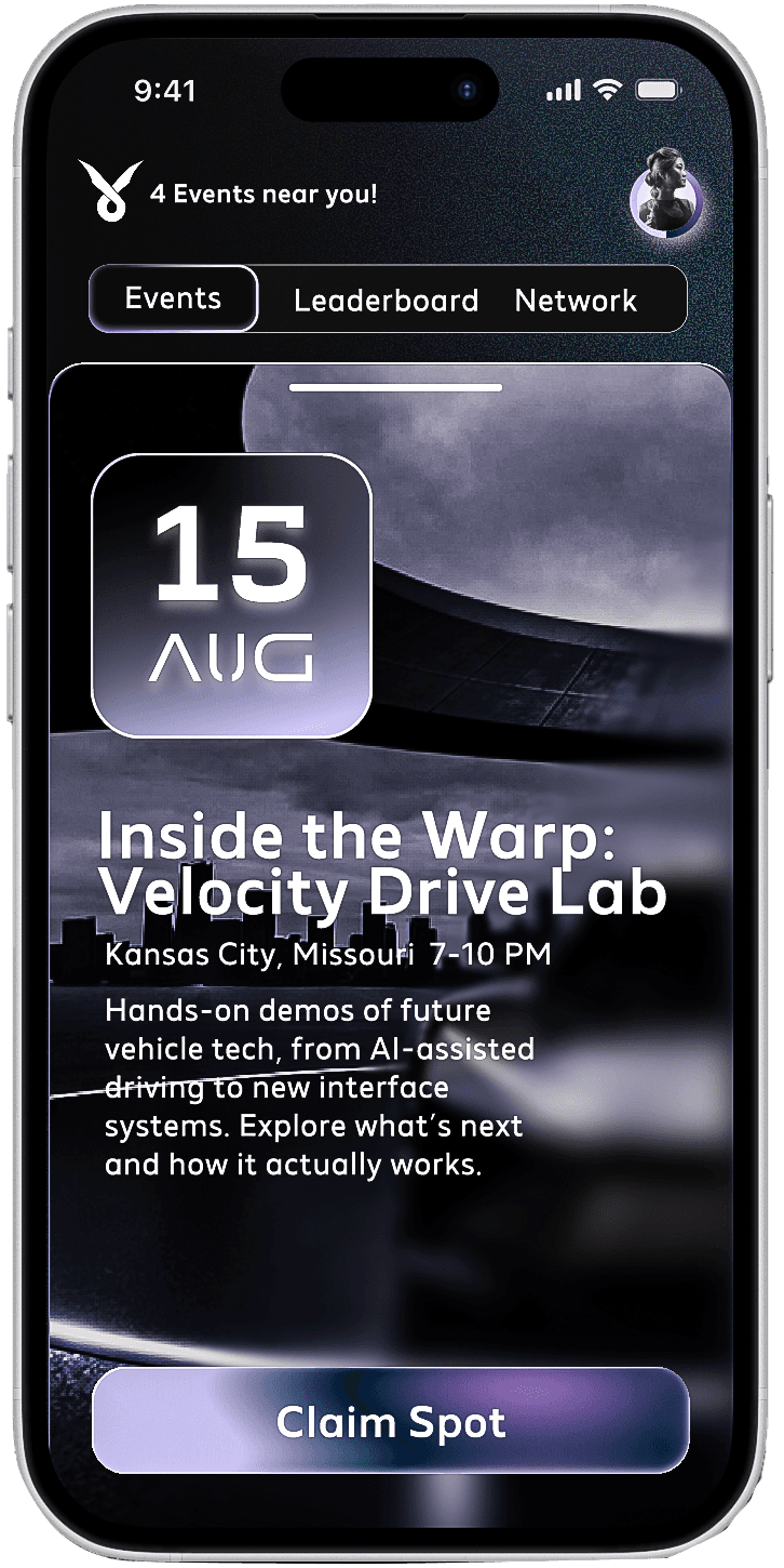
How can an automotive brand respond to a rapidly warping future while creating a digital space that prioritizes community and culture, not just performance and technology that most people don't understand?
Approach
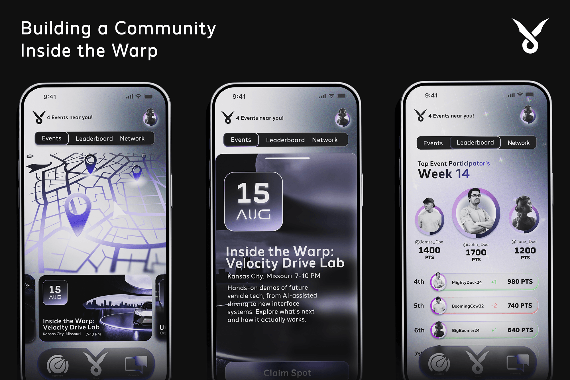
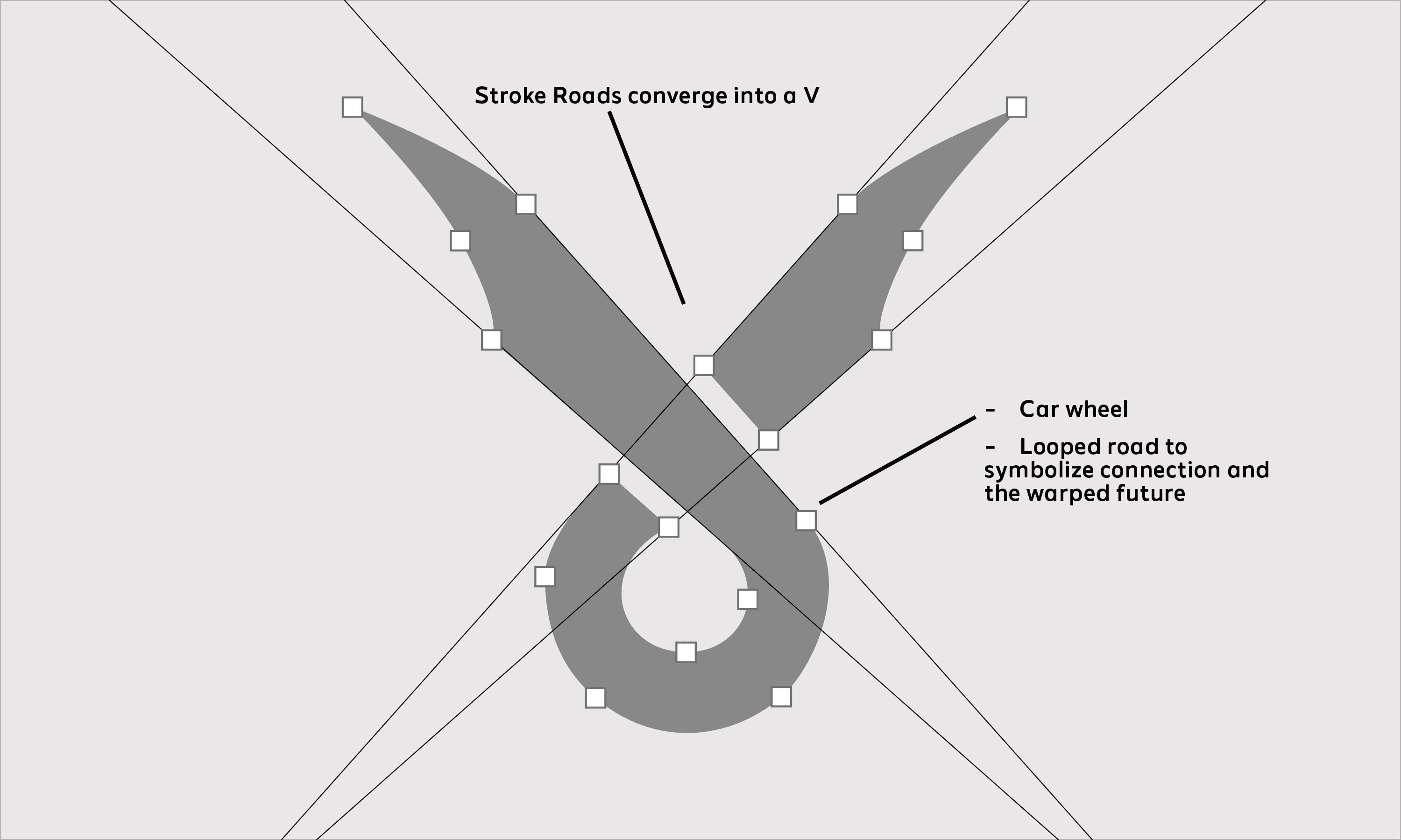
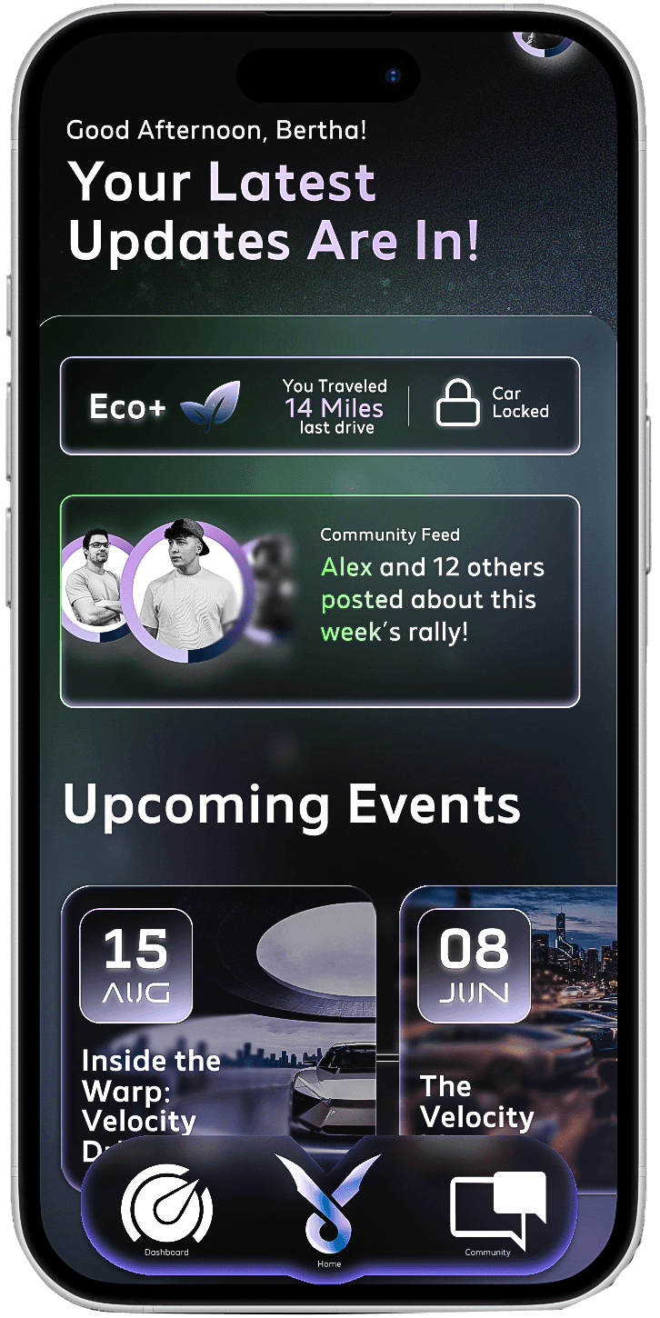
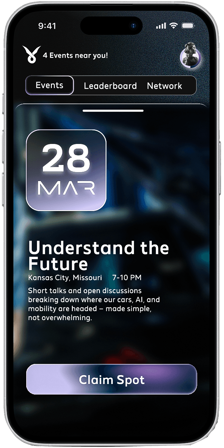
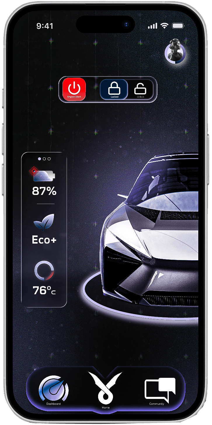
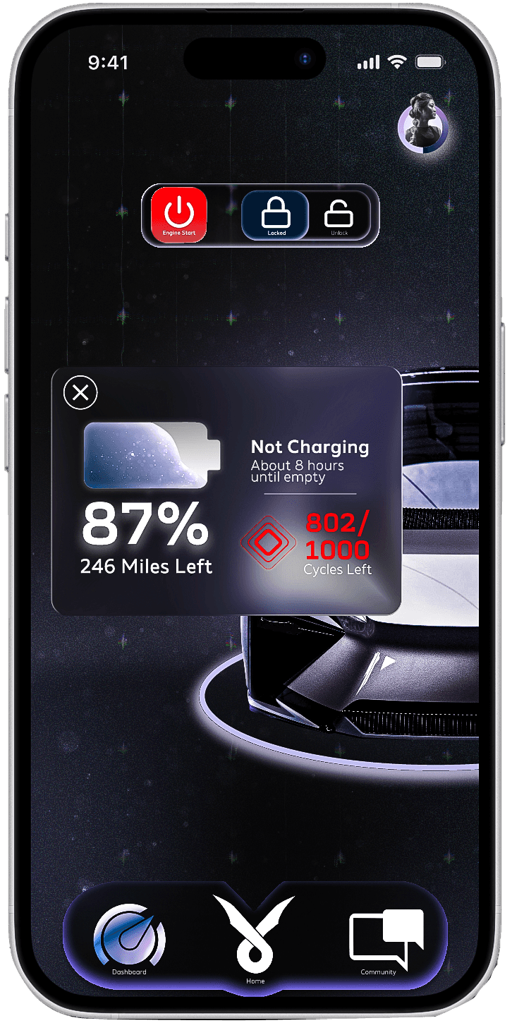
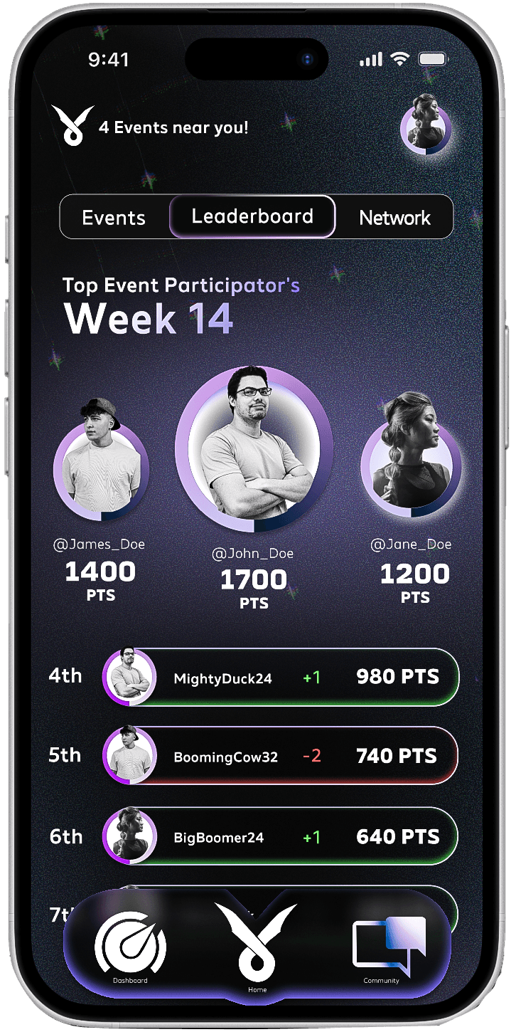
Through warped imagery, a friendlier futuristic type system compared to other Automobile companies, and a periwinkle-purple accent, I aimed to balance a forward-looking aesthetic with an approachable tone. The goal was to make a brand rooted in the future feel inviting rather than intimidating, something anyone could feel comfortable stepping into.
Typography played a key role in shaping that feeling. Made Future Header was used sparingly for headlines and small data points to emphasize motion, distortion, and the sense of a world in flux, while Made Future X supports body text and UI elements with stronger readability, consistency, and a more friendly presence. Together, this pairing lets the interface stay expressive without sacrificing clarity or usability.
FINAL OUTCOMES AND REDESIGNING
Revisiting Velocity Motors months later helped me approach the project with more intention and clarity. The redesign focused on stripping back visual noise, improving hierarchy, and letting the brand’s core idea, guiding people through a fast-moving, warped future, come through more clearly.
Instead of adding more features, I learned the value of restraint, using motion, contrast, and a refined system to create energy without overcrowding the experience. Developing a cohesive style guide and logo system reinforced how strong foundations make design decisions easier and more consistent across platforms. This project pushed me to think beyond individual screens and focus on building a flexible, scalable brand experience rather than
just a polished interface.


More Projects


UI / UX Design
Branding
Velocity Motors
An automotive brand that prepares its audience for the warping fast paced future coming ahead
Tools Used :
Figma Photoshop Illustrator After Effects
Design Focus :
Brand Systems & Digital Experience
Challenge
How can an automotive brand respond to a rapidly warping future while creating a digital space that prioritizes community and culture, not just performance and technology that most people don't understand?
Approach
Through warped imagery, a friendlier futuristic type system compared to other Automobile companies, and a periwinkle-purple accent, I aimed to balance a forward-looking aesthetic with an approachable tone. The goal was to make a brand rooted in the future feel inviting rather than intimidating, something anyone could feel comfortable stepping into.
Typography played a key role in shaping that feeling. Made Future Header was used sparingly for headlines and small data points to emphasize motion, distortion, and the sense of a world in flux, while Made Future X supports body text and UI elements with stronger readability, consistency, and a more friendly presence. Together, this pairing lets the interface stay expressive without sacrificing clarity or usability.
FINAL OUTCOMES AND REDESIGNING
Revisiting Velocity Motors months later helped me approach the project with more intention and clarity. The redesign focused on stripping back visual noise, improving hierarchy, and letting the brand’s core idea, guiding people through a fast-moving, warped future, come through more clearly.
Instead of adding more features, I learned the value of restraint, using motion, contrast, and a refined system to create energy without overcrowding the experience. Developing a cohesive style guide and logo system reinforced how strong foundations make design decisions easier and more consistent across platforms. This project pushed me to think beyond individual screens and focus on building a flexible, scalable brand experience rather than
just a polished interface.
More Projects
UI / UX Design
Branding
Velocity Motors
An automotive brand that prepares its audience for the warping fast paced future coming ahead
Tools Used :
Figma Photoshop Illustrator After Effects
Design Focus :
Brand Systems & Digital Experience
Challenge
How can an automotive brand respond to a rapidly warping future while creating a digital space that prioritizes community and culture, not just performance and technology that most people don't understand?
Approach
Through warped imagery, a friendlier futuristic type system compared to other Automobile companies, and a periwinkle-purple accent, I aimed to balance a forward-looking aesthetic with an approachable tone. The goal was to make a brand rooted in the future feel inviting rather than intimidating, something anyone could feel comfortable stepping into.
Typography played a key role in shaping that feeling. Made Future Header was used sparingly for headlines and small data points to emphasize motion, distortion, and the sense of a world in flux, while Made Future X supports body text and UI elements with stronger readability, consistency, and a more friendly presence. Together, this pairing lets the interface stay expressive without sacrificing clarity or usability.
FINAL OUTCOMES AND REDESIGNING
Revisiting Velocity Motors months later helped me approach the project with more intention and clarity. The redesign focused on stripping back visual noise, improving hierarchy, and letting the brand’s core idea, guiding people through a fast-moving, warped future, come through more clearly.
Instead of adding more features, I learned the value of restraint, using motion, contrast, and a refined system to create energy without overcrowding the experience. Developing a cohesive style guide and logo system reinforced how strong foundations make design decisions easier and more consistent across platforms. This project pushed me to think beyond individual screens and focus on building a flexible, scalable brand experience rather than
just a polished interface.