Branding
Publication Design
Jazz In The Valley
A bold festival hosted by MCC Penn Valley, capturing the electric energy of live jazz
Tools Used :
Illustrator Photoshop InDesign
Design Focus :
Event Branding & Editorial
Challenge
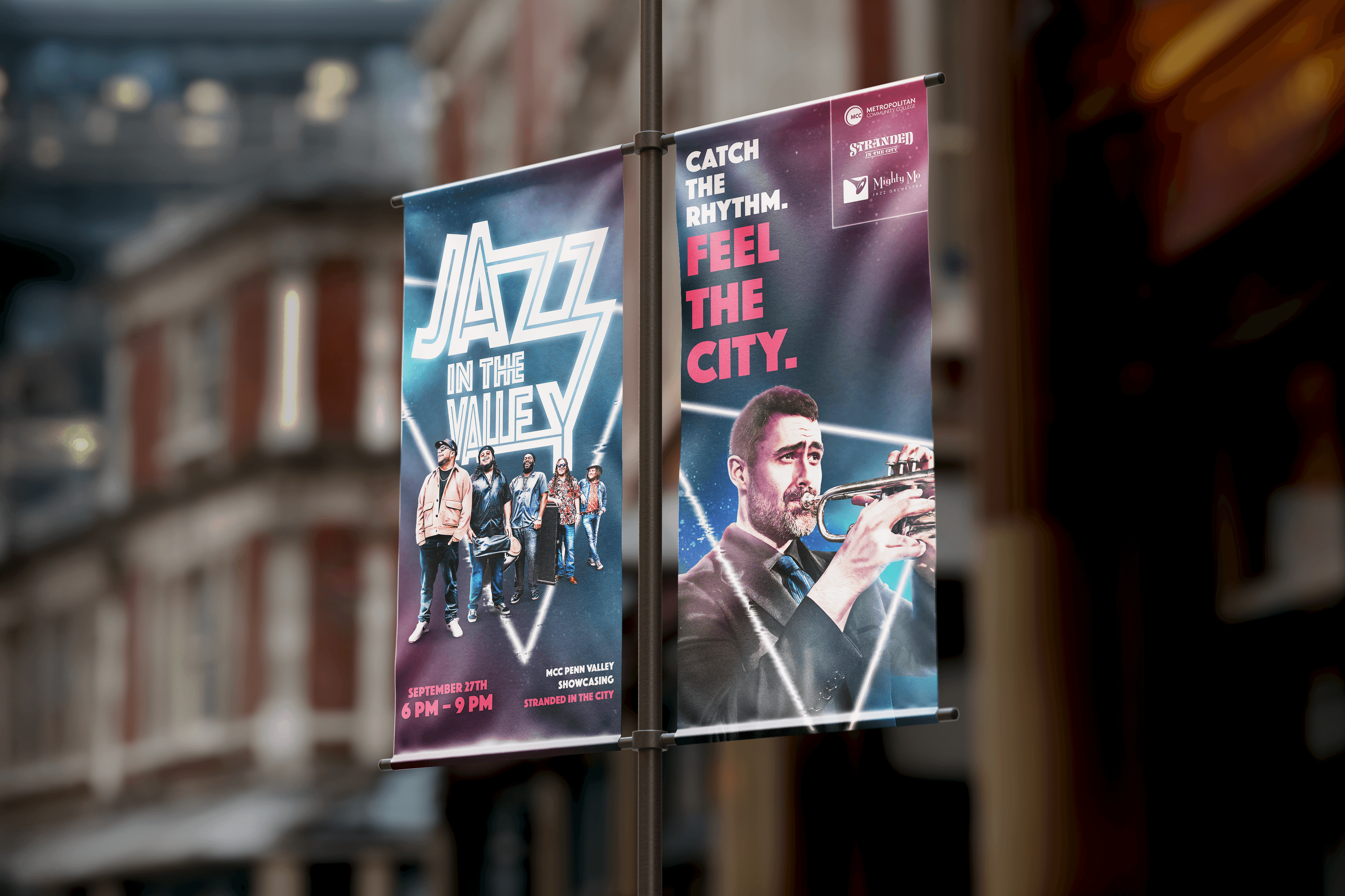
After getting the oppurtunity to design the festival poster for Jazz in the Valley, hosted by MCC Penn Valley, that celebrates Kansas City’s jazz culture while appealing to a younger audience. I took on the challenge to expand that identity into was to communicate the improvisational rhythm and energy of live jazz in a single, eye-catching visual that could grab attention from a distance and feel as alive as the music itself.
Approach
I focused on balancing nostalgia with a modern, high-energy aesthetic. During research, I was drawn to the interiors of jazz venues—the glow of neon lights, intimate lighting, and the upbeat energy of live performances. This led to the core concept of sound brought to light, treating jazz as something dynamic and spatial rather than static. Early explorations using muted colors and traditional jazz references felt too restrained, so I shifted toward neon lighting, vibrant pink tones, and layered compositions to better reflect movement and rhythm.
Solution
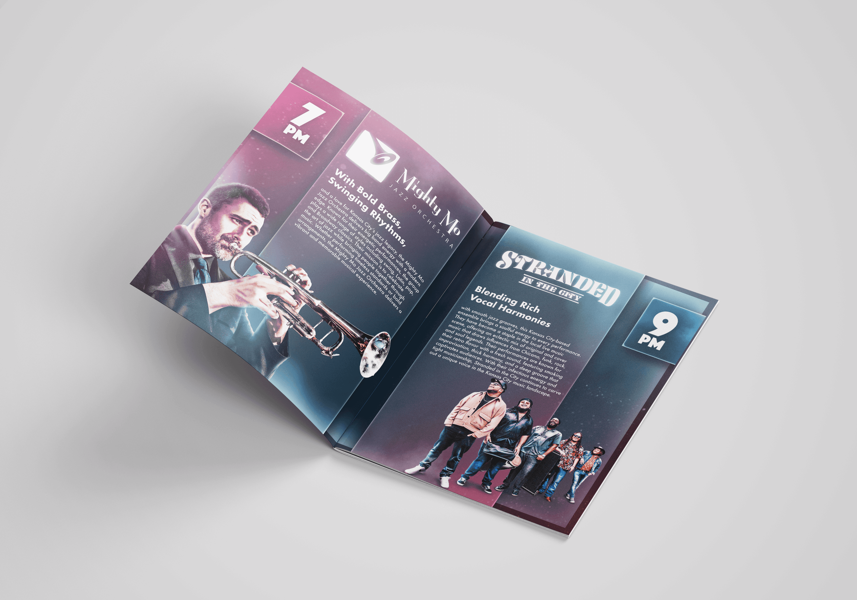
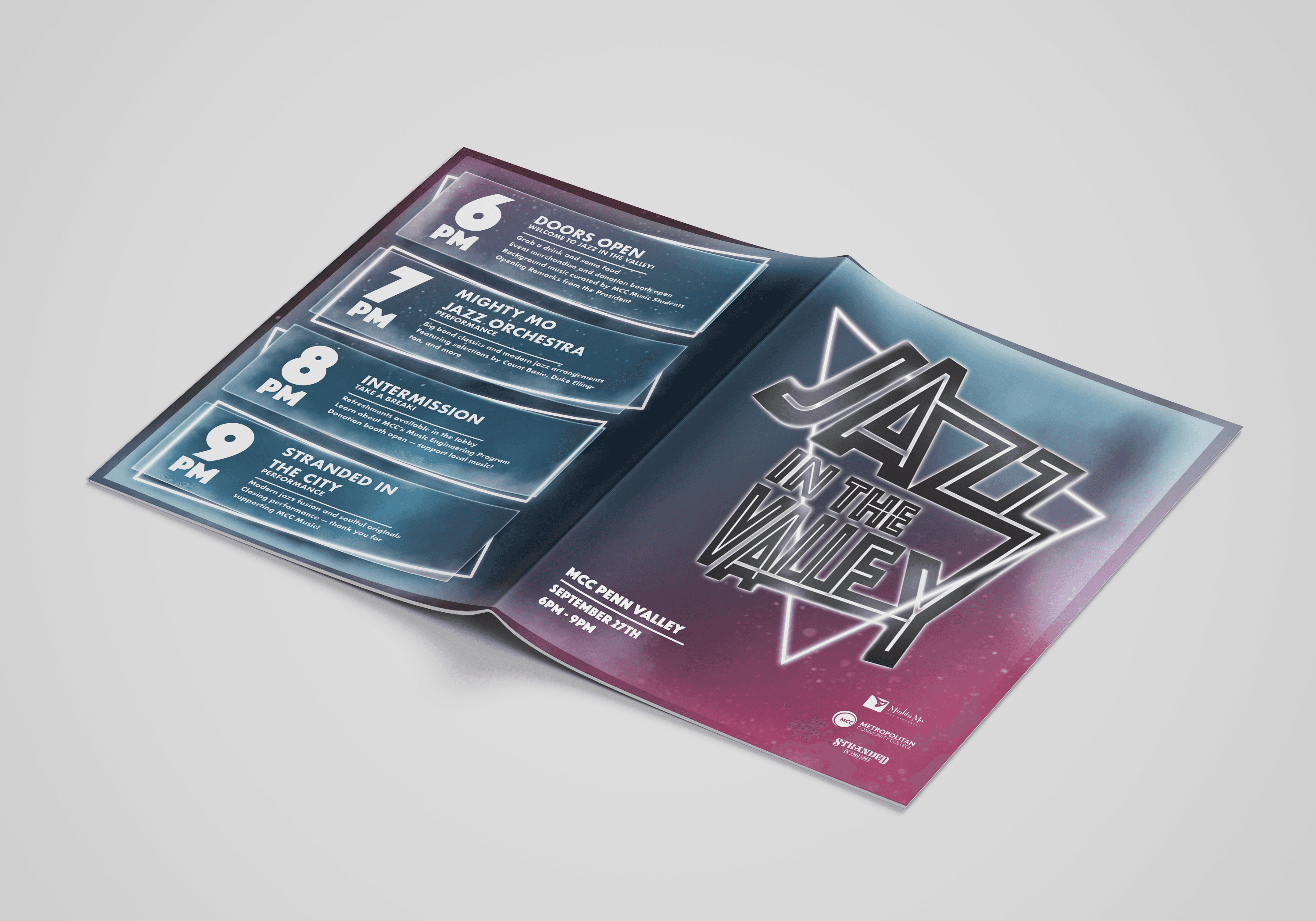
The final poster/identity uses glowing neon forms, layered musician photography, and rhythmic typography to create a sense of motion and improvisation. Angular, syncopated type behaves like part of the performance, while photographic elements fade into geometric light shapes to blend analog and digital expression. The composition guides the viewer’s eye through the layout like a musical progression, capturing the energy and atmosphere of the live event in a bold, contemporary way.

More Projects


Branding
Publication Design
Jazz In The Valley
A bold festival hosted by MCC Penn Valley, capturing the electric energy of live jazz
Tools Used :
Illustrator Photoshop InDesign
Design Focus :
Event Branding & Editorial
Challenge
After getting the oppurtunity to design the festival poster for Jazz in the Valley, hosted by MCC Penn Valley, that celebrates Kansas City’s jazz culture while appealing to a younger audience. I took on the challenge to expand that identity into was to communicate the improvisational rhythm and energy of live jazz in a single, eye-catching visual that could grab attention from a distance and feel as alive as the music itself.
Approach
I focused on balancing nostalgia with a modern, high-energy aesthetic. During research, I was drawn to the interiors of jazz venues—the glow of neon lights, intimate lighting, and the upbeat energy of live performances. This led to the core concept of sound brought to light, treating jazz as something dynamic and spatial rather than static. Early explorations using muted colors and traditional jazz references felt too restrained, so I shifted toward neon lighting, vibrant pink tones, and layered compositions to better reflect movement and rhythm.
Solution
The final poster/identity uses glowing neon forms, layered musician photography, and rhythmic typography to create a sense of motion and improvisation. Angular, syncopated type behaves like part of the performance, while photographic elements fade into geometric light shapes to blend analog and digital expression. The composition guides the viewer’s eye through the layout like a musical progression, capturing the energy and atmosphere of the live event in a bold, contemporary way.
More Projects
Branding
Publication Design
Jazz In The Valley
A bold festival hosted by MCC Penn Valley, capturing the electric energy of live jazz
Tools Used :
Illustrator Photoshop InDesign
Design Focus :
Event Branding & Editorial
Challenge
After getting the oppurtunity to design the festival poster for Jazz in the Valley, hosted by MCC Penn Valley, that celebrates Kansas City’s jazz culture while appealing to a younger audience. I took on the challenge to expand that identity into was to communicate the improvisational rhythm and energy of live jazz in a single, eye-catching visual that could grab attention from a distance and feel as alive as the music itself.
Approach
I focused on balancing nostalgia with a modern, high-energy aesthetic. During research, I was drawn to the interiors of jazz venues—the glow of neon lights, intimate lighting, and the upbeat energy of live performances. This led to the core concept of sound brought to light, treating jazz as something dynamic and spatial rather than static. Early explorations using muted colors and traditional jazz references felt too restrained, so I shifted toward neon lighting, vibrant pink tones, and layered compositions to better reflect movement and rhythm.
Solution
The final poster/identity uses glowing neon forms, layered musician photography, and rhythmic typography to create a sense of motion and improvisation. Angular, syncopated type behaves like part of the performance, while photographic elements fade into geometric light shapes to blend analog and digital expression. The composition guides the viewer’s eye through the layout like a musical progression, capturing the energy and atmosphere of the live event in a bold, contemporary way.