Type Design
Hone Display Typeface
A sculptural display typeface exploring form, elasticity, and system-driven design — a study in honing my craft.
Tools Used :
Glyphs Illustrator Blender After Effects
Design Focus :
Typeface Design & Systems Thinking
Challenge
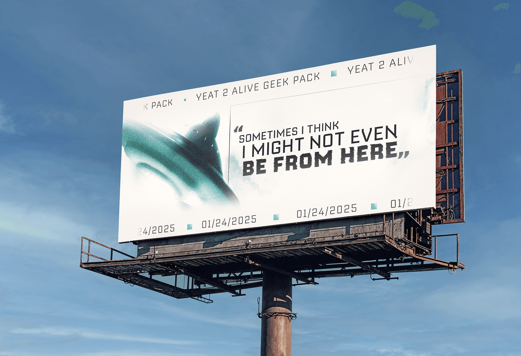
Hone is a display typeface developed through an exploration of expressive form and systematic consistency. Built around exaggerated contrast, warped curves, and flared terminals, the challenge was not in creating individual letterforms, but in maintaining a cohesive visual system across the entire alphabet.

Process
This project began as an exploration into a variable typeface, starting with hand sketches to test how far the letterforms could stretch while still remaining legible. Early on, I visited a special collections library to study historical type specimens, which helped inform the contrast, proportions, and serif details in my design. From there, I moved into digital development, refining a core set of letters and experimenting with animation tests to explore how the type could shift and move across a variable axis. These early explorations helped shape both the final static typeface and its more expressive, motion-driven direction.
*Research references from the Clendening Special Collections Library, University of Kansas.*


After sketching, I refined the forms in Illustrator to build out a consistent system. I then moved into Glyphs to clean up curves and start working through spacing and overall flow. I also experimented with Blender for the first time, using it to explore how the type could exist in 3D and extend beyond static forms.


I also explored animation in After Effects and Blender, testing how the type could stretch, shift, and exist in motion. These experiments helped reinforce the typeface’s elastic and sculptural qualities beyond static forms.
Outcomes
Hone as result is a reflection of my own process of developing and refining my craft. This project strengthened my understanding of systems thinking and how individual forms relate within a larger typographic structure. It pushed me to sharpen my eye for detail, value early sketches, and be more intentional in every design decision. Overall, it challenged me to grow both technically and conceptually as a designer.


More Projects


Type Design
Hone Display Typeface
A sculptural display typeface exploring form, elasticity, and system-driven design — a study in honing my craft.
Tools Used :
Glyphs Illustrator Blender After Effects
Design Focus :
Typeface Design & Systems Thinking
Challenge
Hone is a display typeface developed through an exploration of expressive form and systematic consistency. Built around exaggerated contrast, warped curves, and flared terminals, the challenge was not in creating individual letterforms, but in maintaining a cohesive visual system across the entire alphabet.
Process
This project began as an exploration into a variable typeface, starting with hand sketches to test how far the letterforms could stretch while still remaining legible. Early on, I visited a special collections library to study historical type specimens, which helped inform the contrast, proportions, and serif details in my design. From there, I moved into digital development, refining a core set of letters and experimenting with animation tests to explore how the type could shift and move across a variable axis. These early explorations helped shape both the final static typeface and its more expressive, motion-driven direction.
*Research references from the Clendening Special Collections Library, University of Kansas.*
After sketching, I refined the forms in Illustrator to build out a consistent system. I then moved into Glyphs to clean up curves and start working through spacing and overall flow. I also experimented with Blender for the first time, using it to explore how the type could exist in 3D and extend beyond static forms.
I also explored animation in After Effects and Blender, testing how the type could stretch, shift, and exist in motion. These experiments helped reinforce the typeface’s elastic and sculptural qualities beyond static forms.
Outcomes
Hone as result is a reflection of my own process of developing and refining my craft. This project strengthened my understanding of systems thinking and how individual forms relate within a larger typographic structure. It pushed me to sharpen my eye for detail, value early sketches, and be more intentional in every design decision. Overall, it challenged me to grow both technically and conceptually as a designer.
More Projects
Type Design
Hone Display Typeface
A sculptural display typeface exploring form, elasticity, and system-driven design — a study in honing my craft.
Tools Used :
Glyphs Illustrator Blender After Effects
Design Focus :
Typeface Design & Systems Thinking
Challenge
Hone is a display typeface developed through an exploration of expressive form and systematic consistency. Built around exaggerated contrast, warped curves, and flared terminals, the challenge was not in creating individual letterforms, but in maintaining a cohesive visual system across the entire alphabet.
Process
This project began as an exploration into a variable typeface, starting with hand sketches to test how far the letterforms could stretch while still remaining legible. Early on, I visited a special collections library to study historical type specimens, which helped inform the contrast, proportions, and serif details in my design. From there, I moved into digital development, refining a core set of letters and experimenting with animation tests to explore how the type could shift and move across a variable axis. These early explorations helped shape both the final static typeface and its more expressive, motion-driven direction.
*Research references from the Clendening Special Collections Library, University of Kansas.*
After sketching, I refined the forms in Illustrator to build out a consistent system. I then moved into Glyphs to clean up curves and start working through spacing and overall flow. I also experimented with Blender for the first time, using it to explore how the type could exist in 3D and extend beyond static forms.
I also explored animation in After Effects and Blender, testing how the type could stretch, shift, and exist in motion. These experiments helped reinforce the typeface’s elastic and sculptural qualities beyond static forms.
Outcomes
Hone as result is a reflection of my own process of developing and refining my craft. This project strengthened my understanding of systems thinking and how individual forms relate within a larger typographic structure. It pushed me to sharpen my eye for detail, value early sketches, and be more intentional in every design decision. Overall, it challenged me to grow both technically and conceptually as a designer.